Here’s a little more behind the scenes about my senior graphic design capstone project.
If you haven’t read Part 1, you can read it here!
Step 4: Illustrate Everything
How do you visualize a Shakespeare play? And how do you make it interesting for a modern audience?
Many artists have illustrated Shakespeare plays in different ways over the centuries, and performances of Shakespeare plays have taken inspiration from different time periods and styles. At first, I started doing illustrations in charcoal…
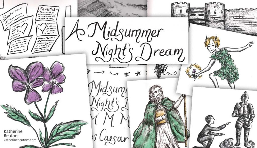
But then I realized this style wasn’t quite right for my project. The title was Your Painless Guide to Shakespeare, so I needed something that looked more modern and more, well, ‘painless’ and fun.
So I started doing digital illustrations, which seemed to work better. I really like how they turned out, and I had a lot of fun making them.
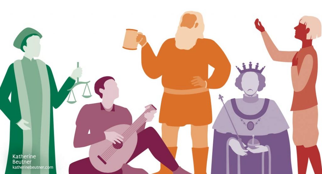
Above, from left to right: Portia from The Merchant of Venice, Feste from Twelfth Night, Falstaff from Henry IV, Parts 1 and 2, Richard II from Richard II, and Romeo from Romeo and Juliet.
(Side note: Shakespearean history plays, including Richard II and Henry IV, are quite underrated, in my opinion. I highly recommend checking them out.)
Step 5: The Type is Right
As I was deciding on the illustration style, I started developing the typographical style of the book.
Typography is the study of typefaces/fonts. Choosing the right typeface matters. Like, you definitely wouldn’t use Comic Sans in a logo for a bank…

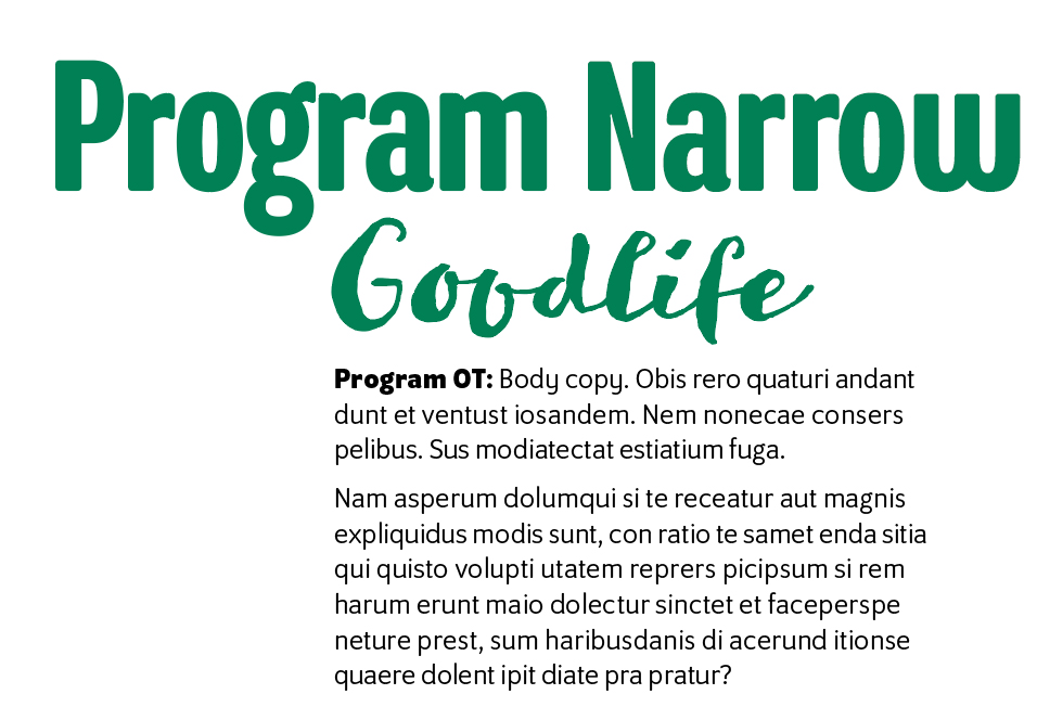
Point being, typefaces are important. For my book, I finally settled on a few nice type families. Program’s rounded corners worked well with the illustrations, and I used a narrow version of the typeface for headings. I also found a type family called Goodlife that I used for special accents throughout the book.
Step 6: Mastering the Page Layouts
In design, a master page is a template you use to make all the other pages. It includes the grid, margins, gutter, guides, etc.—basically, the blueprint for the page. You use it on each page so the document looks consistent.
It takes a lot of tweaking and printing out test pages to figure out what all these measurements need to be. This is what a page looks like behind the scenes in InDesign with all of the guides and object boundaries visible:
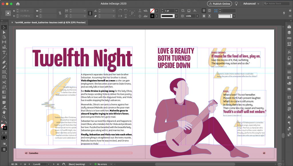
It might look a little scary or complicated, but honestly, master pages are your best friend when you’re laying out a book.
Step 7: Plug and Play
At this point, finishing the book is just a matter of inserting the illustrations and written content into the master pages—a time-consuming but pretty straightforward step.
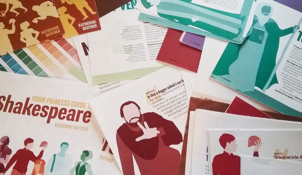
The unglamorous way of saying that is: I spent a lot of hours copying and pasting text, squinting at the computer screen, printing out drafts on paper, then going back to the computer and fixing mistakes I had completely missed and that a classmate or professor pointed out. 🙂
I was just cleaning out my room and found all these drafts I’d printed out. And these are just a few of them! Lots of drafts…
Step 8: Putting out Last-minute Fires
Of course, whenever you think a project is almost done, five more problems crop up.
For example, a test print revealed that the bookbindery’s equipment printed colors differently than my printer. So just when I thought I was done with the InDesign file, I had to go in and edit one of the color swatches again.
But it all worked out!
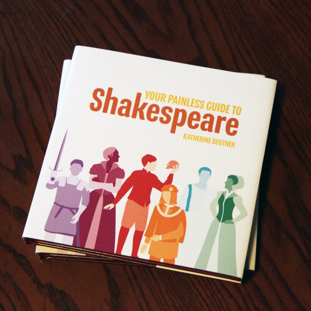
The book was displayed at my senior show last year, which was pretty cool. If I do publish it someday, I’d want to add a lot more content and take more time to research each play.
Until then, my next goal (just for fun) is to read all the other Shakespeare plays that didn’t make it into the book!
In the meantime, you can see my other graphic design work at katherinebeutner.com/portfolio. Right now, I’m working as a graphic designer—and trying to write stories in my free time. More about that next month…
Which Shakespeare plays have you read or seen performed? Let me know in the comments. Thanks for reading!
Like what you read? Take a minute and share it with your friends or connect with me online!
